Ace Logos: The Grommet
The Grommet visual brand is a mixture of clean and modern with rustic and vintage, swaths of blue along with distressed metal and wood textures, with orange as a call to action highlight color.
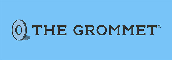
Primary Logo
The horizontal, four-color version is the main logo, and should be used in all executions when possible. The preferred way to use the primary logo is over a white/light background for maximum impact and clarity.
 DOWNLOAD FOR WEB
 Primary Woodmark

The “hero grommet” illustration woodmark may be used in limited applications. It should not be used in place of the primary logo. The preferred way to use the primary logo is over a white/light background for maximum impact and clarity.
 DOWNLOAD FOR WEB
 The Grommet Style Guide
For more detailed rules on usage as well as logo variants please refer to the full Grommet brand guide available here: