Typography: Do’s & Don’ts
Some basic guidelines for how to use Ace typography properly in your communications.
Do
- Use the formula for 6 pt. intervals for headline size
- Select the right logo color way for optimal legibility
- Create headline block lockups using Roboto Condensed Bold
- Limit length to no more than three lines
Don’t
- Stretch type
- Apply drop shadow or glow treatments
- Insert gradient fills within type
- Stack headlines to create block lockups that exceed three lines
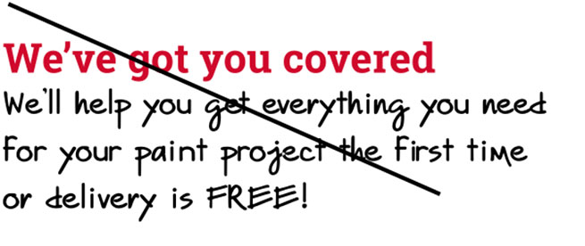
- Use Ace Handwritten for headline or descriptor lines
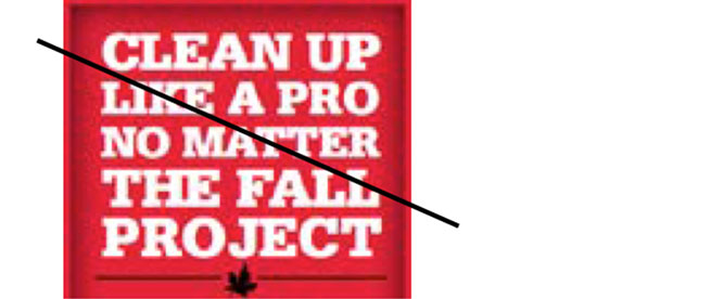
- Use Roboto Slab Serif Bold in all-caps
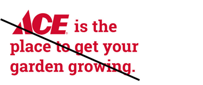
- Use “Ace” in headlines when our brand logo appears in layout
Ace Handwritten as descriptor copy
Shadow behind type

Stretched type / Roboto Slab all caps

Roboto Slab all caps lockup / lockup too long
Ace logo used as copy