Preprint: Design Elements
Our preprint design system is embodied by these core design elements.
The Logo Brick
The brick was created to ensure that the logo stays in the same place on all preprints. The brick is reminiscent of a pocket on the red Ace vest. It should always be placed in the upper left corner on both the front cover and the back cover.

Fonts
The two characteristic fonts used for the print design of Ace Hardware are:
Roboto and Roboto Slab. Mindset is a more lively and fun typeface, that we use to create “Buy One Get One” or “Buy this get this...” communication.
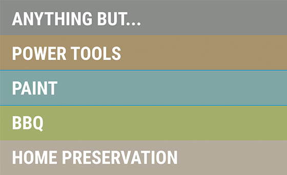
One color for each category.
These are the defined colors for the Famous For Four categories. Anything But… Is used whenever you need e.g. a background color and the product doesn’t fall under the FF4 categories.

Impactful Photography
We use images with intensity. We see eye contact as a great way of connecting with the consumers. We use strong product-related images with subjects looking into the camera to help make a connection with the consumer.
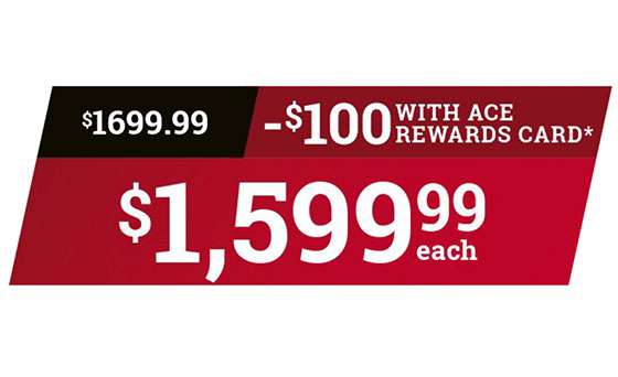
Strong visualization of price and benefits.
The price splatter is designed to give maximum awareness to the price messaging. It has a certain “POP” to it – and it is very easy to read and understand on a page with a lot of information.
Clear and Intuitive Iconography
When we introduce the Famous For Four categories, we have the category title and the corresponding category icon to either the left or right in the top bar, depending on the design.
Still have questions? Download full detailed specs for circular production in pdf format here. You can also contact us at preprints@acehardware.com
Download Complete Style Guide